


NRL Jersey Christmas Has Arrived
Unpacking the new 2025 NRL Jerseys revealed so far this November.

Yes, I still have a Substack!
It’s unfortunately been quite some time since I was last able to contribute anything to this space. With a full-time job, too many freelance obligations and a five week European holiday thrown in the mix, there’s been no time left over for little old niche writing hobbies.
But worry not, I am back and here to cover everything that’s happened over the first week of November in the NRL jersey world. From the excitement of the Blues moving to Adidas to the surprise of the Cowboys rebranding as the North Queensland 30’s, I’m here to give my thoughts, adjustments and concepts to any of the new jerseys and logos released over the last week and a half.
A few disclaimers to get out of the way first:
Please remember that these are just my opinions on the jerseys and I’m very much not saying what is right or wrong - merely what I would do if I had control over every team. I am also aware that I am not tied to any people above me, creative briefs or other meddling hands that often lead to great jerseys being left on the cutting room floor.
I am VERY aware that ugly sponsorships are a massive detractor from the overall design of a jersey (looking at you Lottery Office), so I have tried to avoid focusing too much attention here and primarily discussed the elements that designers can actually control.
With that said, lets go!
The Canberra Raiders

Where else to start than with my beloved Canberra Raiders. With the majority of my subscribers being the trusted Milk faithful, it’s only fair I provide the good stuff straight off the bat.
As an overall set - I like them! The home/primary jersey has only received minor cosmetic changes since they shifted to a darker shade of green in 2019 and the addition of the white, blue and gold hoops to the side of the torso are a nice touch. I was hoping they’d continue to wrap around the back of the jersey, as was seen in the 2024 away strip, but it’s a minor complaint in the grand scheme.
The away jersey is where I have a few bones to pick, though I’m very much in the minority here as the overall reaction has been overwhelmingly positive. It’s modelled off a jersey that was worn by the club as part of the 1992 Great Britain Tour, which I love, but I think with the modern iteration of the jersey comes out looking far too predominantly blue. Particularly when paired with blue shorts and primarily blue socks, I think on-field and on TV this jersey will come out looking far too much like a Bulldogs or Knights alternate. I can already envision the tweets and comments saying “I didn’t know the Bulldogs were playing” during Raiders away games. My personal tweak of the jersey is to switch the secondary colour of the strip to be green rather than blue, providing a traditional looking jersey that gives a nod to the 1992 edition, while also feeling quintessentially Raiders.

The green ‘colour rush’ alternate jersey which is to be worn in Vegas is one that I lean towards liking. I think the jersey in isolation is a little bit second division soccer vibes, but I love the jade green shorts and I think as an overall kit it will look quite vibrant. It also has by far the best sponsor integration of the three and will only be worn a couple of times so I’m very okay with it.
The _ Dolphins
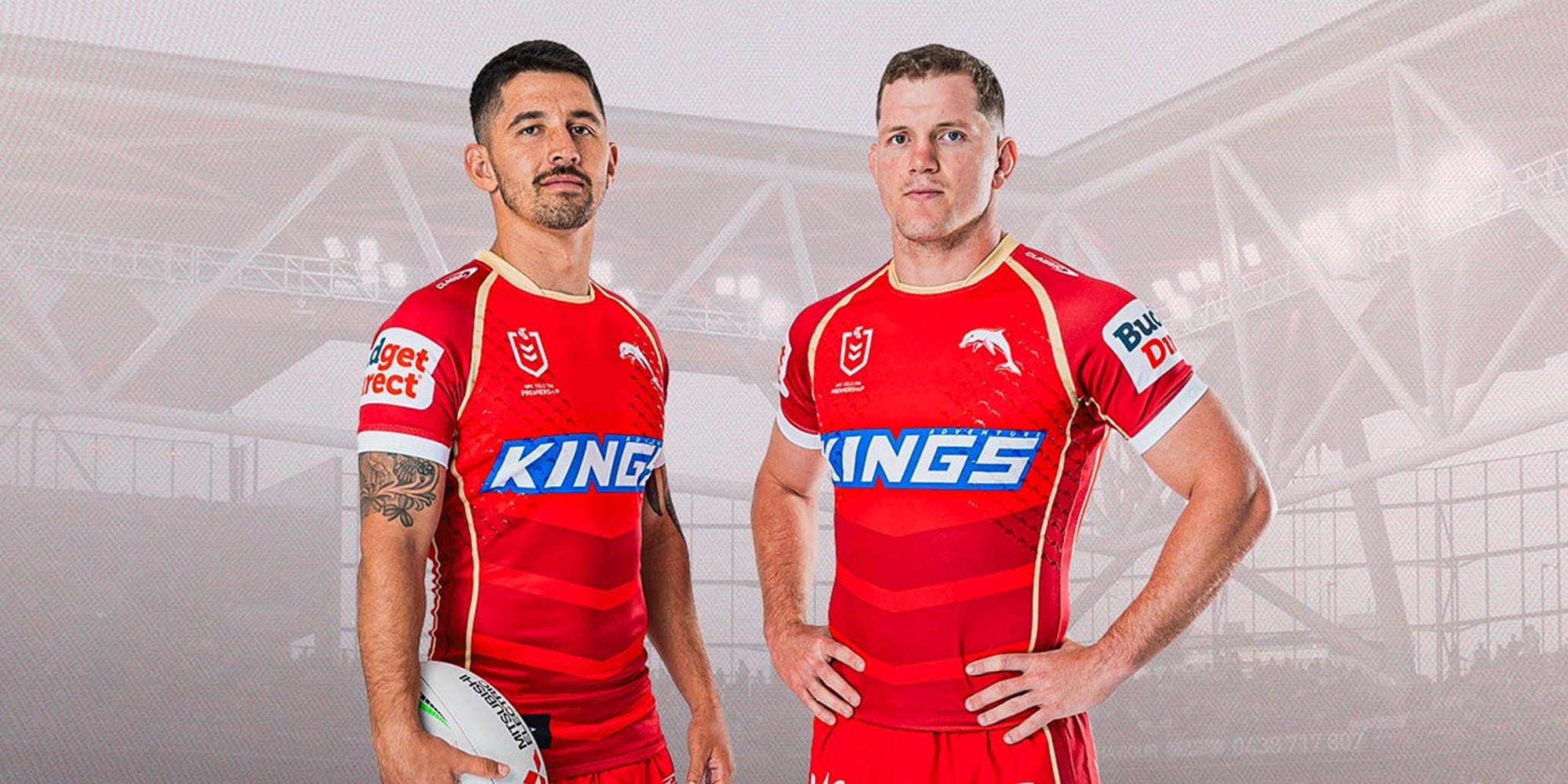
I was a big critic of the first iteration of Dolphins NRL jerseys so I was very eagerly waiting to see what they had in store for their second ever set of jerseys. While their original set did tend to grow on me as the two seasons went on, I still thought they were an uninspiring design that too closely mirrored that of their rival Broncos.
I am pleased to say that I’m a much bigger fan of their 2025 jerseys, which maintain some design elements of their inaugural strip but evolve to a cleaner overall look and feel. The two-tone red looks really sharp and the gold trim compliments it nicely. If I was nitpicking I would have maybe tried to find a way to work a little bit more gold/white into the entire kit as a whole, but overall I think it’s a massive step in the right direction for the Dolphins.
The North Queensland Cowboys

It’s the Cowboys 30 year anniversary this year (if you couldn’t tell from the logo), which had me very excited to see what they’d unveil given their incredible history of jerseys. They’ve decided to pay tribute to their iconic 1995 strip for the occasion, which are some of my very favourites, and I think they’ve absolutely done them justice. The home in particular is my favourite of the three, and I love that the shorts and socks are also identical to the original strip. The alternate is a long awaited throwback to their 1995 World 7’s design, and while it’s one that I love, I’m a bit unsure as to why they’ve gone with such a highlighter yellow, rather than the more traditional Cowboys gold from the original.
While the obnoxious Toyota box in the middle of the three jerseys is obviously frustrating, my main critique of the actual designs is that the huge 30 in the logo is a really bizarre choice. I’m not sure why they wouldn’t have just gone with something like they did for their 25 year anniversary, which featured the iconic Cowboy horns with “25 years” underneath.
The Gold Coast Titans

Unfortunately these are the first ones of this series that I’m not a massive fan of. In my opinion the Titans always look both aesthetically better and more unique in their identity when they focus on their sky to ocean blue gradient, sandy gold and white. While this jersey is a nice nod to their 2010-12 Adidas strips (which I did actually like as a kid), I’ll just always be more in favour of their original colour scheme. Moving past the tone of the jersey, I do actually think the titan helmet is quite well executed in the design of the torso and I do like the socks, but my preference would’ve been bright blue shorts like they had in 2011, rather than white. I’d also like to have a brief moment of sadness for the poor designer who created this jersey and then had to watch the eye sore of a sponsor that is the Lottery Office be slapped on top of it.

Overall I do think these are jerseys that will grow on me throughout their two year run, but I also think I’ll still be eagerly waiting a move back to sky blue in 2027.
The Canterbury Bankstown Bulldogs
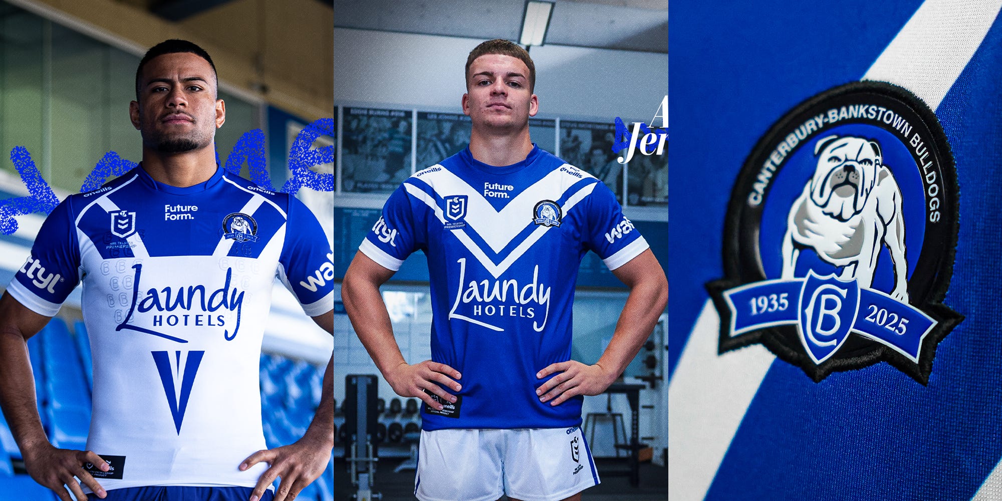
This home jersey in particular is a kit that I am very strongly conflicted about. On first glance, I think it’s a significant improvement on their 2024 edition and feels far more uniquely ‘Bulldogs’. The logo is also perfect for an anniversary season, channelling elements of both their past and their present into a clean design. However the more I look at the home jersey, the more I am a little disappointed in the execution of a few of the design elements. The sleeves are essentially a “fake raglan”, which means they’ve added a white strip to the shoulders to make it look like the jersey is a raglan cut when it is actually a set in sleeve, while the sponsor box feels far more intrusive this year than last. I think while on-field and on TV the jersey will still look like an upgrade on last season, it’s a little bit frustrating that the execution of the iconic 2004 design feels so much sloppier than last season’s heritage jersey.
The Parramatta Eels

Sometimes we forget that rugby league and everything in and around it is very simple. Whoever decided to try and big brain the Eels wardrobe and design them a predominantly white and blue alternate jersey should be exiled from the game forever. There are few better aesthetics in rugby league than a well executed gold Eels jersey and this is absolutely one of them. A+.
Other Releases
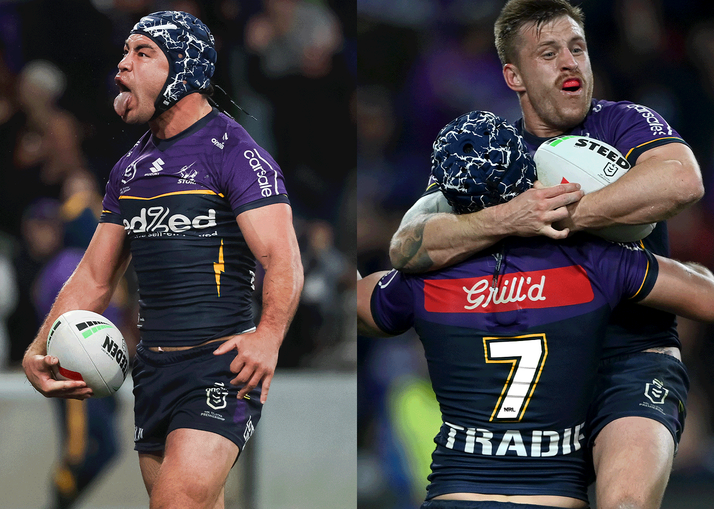
The Storm, Panthers, Dragons, Knights and Rabbitohs have all released their 2025 jerseys as well - with little to no change as they’re either not on a new jersey cycle or want to remain consistent. The only minor minor tweak that I’d have loved to have see from this group is a move from the highlighter yellow to a more traditional yellow/gold on the Storm jersey.
New South Wales Blues x Adidas
Thanks to the Internet sleuthing of Retro Rugba League and someone eager enough to check out Rebel Sport NZ, we have some near confirmation that the NSW Blues have switched from Puma to Adidas for the 2025 season. As someone who once spent well over 100 hours working on Adidas concepts for every NRL team, this set the mind racing for some concepts for the Blues in 2025. In an ideal world, I’d love to see a return to a more traditional collar (as Queensland have done the last few years) and some nicer sponsor integration with the Westpac logo. In reality though it will likely be something more like the second round of concepts - featuring a more vibrant shade of blue and an ugly red W plastered on the front. Either way, I thought the work done by Puma was uninspiring to say the least, so I’m excited to see what a new manufacturer can do.


Both teams having the same sponsor in Origin is still so weird. Especially when QLD get to go white and make it look nice and NSW are stick with the big red monstrosity. It was crazy how badly Puma screwed up what should be a very easy jersey. Let hope Adidas do better.
Was quietly worried about the Phins but I have to admit they’ve done a great job. Agree that I would have liked a little bit more gold but I’ll take what we got.
Don’t get the hype on the Bulldogs ones. Everyone seems to be a lot more in to them than I am haha.
Keep up the great work Brother.
Great article. And cheers for the shout-out
- Retro Rugba Leeg